Canvas Wrap Article, November 2004
Welcome to CANVAS WRAP and my ongoing series of step-by-step instructional articles on the art of airbrushing as fine art. CANVAS WRAP will present a “no secrets” approach in these articles. If I’ve done it, I’ll show it, and if I know it, I’ll share it. Most projects featured here will be demonstrated on a prepared canvas, but most processes will also apply to the illustration board. For those desiring to work on a smooth canvas surface, I’ve written and posted an article on my website titled Creating The Perfect Ultra-Smooth Canvas For Airbrush.
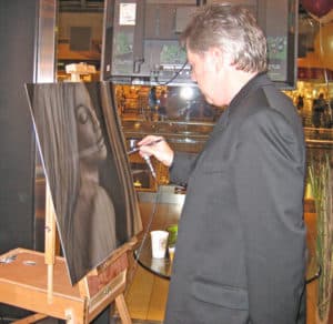
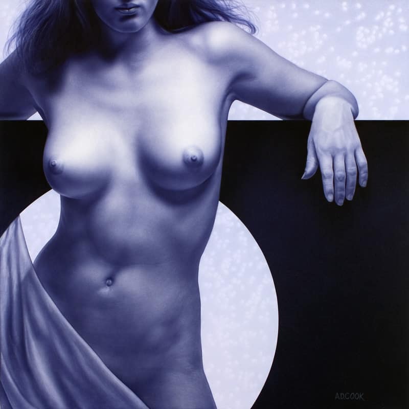
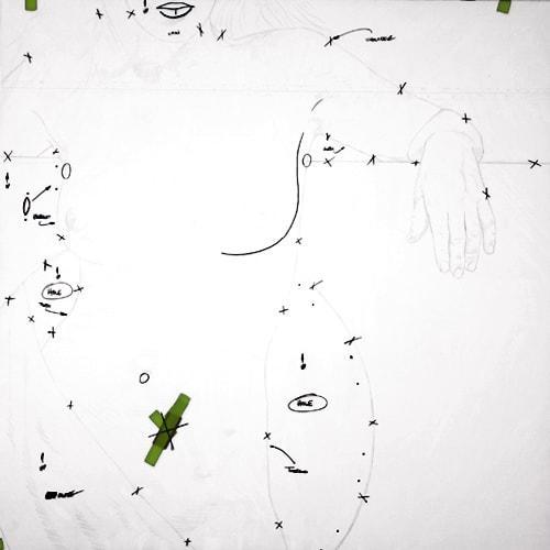
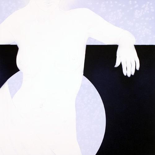
My recent series of paintings have been life-size and larger figurative paintings. In my recent painting titled Eclipse (36″ x 36″, I’ve stayed with a monochromatic theme of blues, and our figure is painted a bit larger than life-size. In our first installment of CANVAS WRAP, we’re going to start at the beginning of a painting rather than focus on specific items. Throughout the following few articles, we’ll focus on individual components and discuss the workings of other parts of the human figure; hands, torso, hair, and touch base regarding various textures. I photograph all my reference materials and subject matter – in this case, our model Lynsey in front of a prop I created by cutting a circle in a piece of black Gatorboard. From those, I chose my final painting reference image. The computer manipulated the color photo, and I decided to paint her in blue-violet hues. Once I’m happy with what I see on screen, I print it out as a large-high-quality print that I will refer to as I paint and also as a smaller print that will fit in my projector. The transfer of the image to canvas is pretty straightforward, but at the same time, it’s essential to get it right. I project my image onto the canvas and draw her lightly with a blue watercolor pencil. I always try to remove the image with a pencil closest to the color I intend to paint. Watercolor pencils are my preferred option because they tend to disappear when painted over, are easily erased, and are compatible with acrylic-based paints (as opposed to lead or wax-based pencils). Take your time in the drawing process to make sure you draw everything important, but at the same time, try not to remove so much that it becomes a drawing. I try to include some light shading as reference points in areas with no distinct lines.
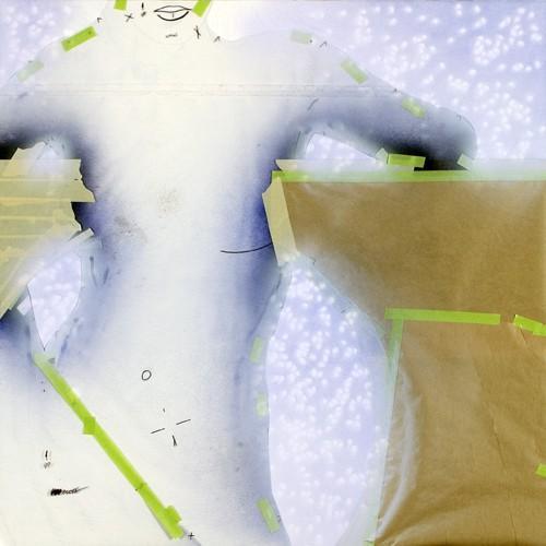
An example of this would be ribs, abdominal area, shoulder, variables in the cloth, and shadows. Once I’m satisfied with the drawing, my next step is creating my acetates. Very little masking was used for this painting. Instead, she’s masked almost entirely with 5-mil acetate assisted with the use of Artool templates. We’ll get into some of this later. For now, using clear tape, I’ve joined a couple of pieces of 30″ “x 40” “acetate to make a sheet large enough to cover the entire painting. Next, I trim the acetate piece down to 36” “x 36”, which is the exact size of my canvas. The canvas is then laid flat, and the acetate is positioned and taped with masking tape to hold it in place. (Properly planned, this entire painting will be created using one acetate sheet.)
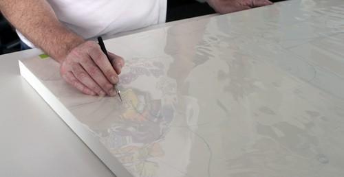
Now starts the fun part. I cut every shape in the entire painting using an X-Acto knife with a new #11 blade. Sometimes I do this with the art flat, and other times with the canvas on the easel. Whatever is most comfortable for you is fine. I caution here only to cut deep enough to score my acetate, being especially careful not to cut all the way through. Then, with a Sharpie pen, I draw marks across the cut lines, so that alignment of the pieces is easier later.
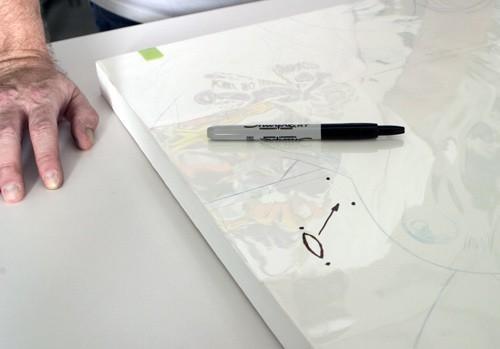
At this time, I also cut shapes that look like cat’s eyes and draw a dot at each end to see them easier later. These shapes will be popped out, and the openings taped over to hold the acetate down along various edges. Lastly, I add notes on the individual shapes to remind me later what they are. Sometimes the notes just reference “p” and “Torso” or whatever I think I’ll need to know later. What seems obvious now may become a bit confusing as these pieces get popped out, and the acetate is dismantled and reassembled throughout the painting. The notes will be beneficial in identifying the pieces and aid in accurately repositioning them later.
I typically paint back to front, so I start by removing acetate pieces to expose the background area, leaving our lady covered for now. Separate the parts by gently folding the acetate back against the scores to pop the individual pieces apart. They will come apart quite easily if you’ve scored the acetate properly. If you encounter resistance, take your knife and carefully re-score the lines as needed. Avoid pulling the acetate so as not to distort it. The removed acetate pieces get taped to the studio wall for future use. To make life a bit easier, I position them like a giant puzzle. This is an excellent time to mix some paint. This painting is monochromatic, meaning it’ll appear as a one-color painting when finished. I combine a selection of colors to get the desired blue, but you could paint it any color you want. I wanted a winter-like feeling for this piece, so a dark blue seemed the obvious choice. The wall surface that our model is leaning against gets painted first. (Normally, working back to front, I’d paint the sky area first, but in this case, I’m painting the wall to establish my darkest values). My first step is to get some color down, so I lightly build up the value using an Iwata LPH-50 Spray Gun to create an even fill with blue. Keep this light as we’ll be adding texture, and it’ll be important to show through.
IIt’salways easier to darken later.
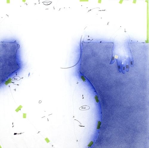
Next, I switch to an Iwata HP-C to add a stipple effect – lots and lots of stipple. To do this, remove the nozzle from the front of the airbrush and crank your air pressure up to 50 PSI. Spray the background to keep darkening it, but now you’ll get a nice coarse texture instead of the fine spray offered by the spray gun. Vary the air pressure, spraying some texture at 30 PSI, 40 PSI, and then 20 PSI until you achieve the desired result. This is an excellent thing to practice on a scrap before approaching your painting. You can create shading using the course texture rather nicely with a bit of practice. Next, I switch to Com-Art Opaque Black and repeat the process, adding shadows under her hand and as needed. Then I replace the nozzle on my airbrush and laze over everything with my blue again so that my black becomes a blue-black, which looks more interesting than straight black.
Allow the background to thoroughly dry (usually overnight), then mask over everything previously painted—at this point, I will also keep the torso protected as I prepare to paint the area behind her and the wall. I’ve used masking tape, masking paper, and acetate to do everything here, but you could just as easily use frisket for this. If you’re going to use masking tape, make sure it’s good quality (I only use 3M brand tapes because they’re easy to remove and don’t leave residue behind). Notice at this point that I’ve used tape (or frisket) where I want a crisp edge and acetate masking where I want softer edges. Also, the acetate covering the torso has never been removed from the canvas, ensuring an exact edge. This background is now ready to paint.
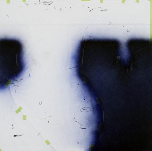
I wanted the area behind our lovely lady to have a winter-like feeling. To achieve this, I start by airbrushing a blend of my blue – darker in the upper right-hand corner, fading to lighter in the bottom left-hand corner. This is all painted with an HP-C, working slowly to keep the color light. Next, I lay the painting on the floor and randomly dispersed lentils. Now spray another gradation with the beans in place, but rather than spraying directly at the lentils, spray at an angle (again, this is something worth playing around with on scrap before jumping straight to your painting).
Be sure to spray lightly here, making sure you don’t blow the lentils around (This blend was sprayed at about 15 PSI, again using the HP-C). Remove the lentils, and we’re back to the easel. My next and final step is to spray over the entire area with a light color, a mixture of Com-Art White mixed with a few drops of my blue paint. All I’m trying to do here is ghost back the background and take the edge off the stencil’s shapes. Finally, I can now unwrap my canvas.
The background is now finished and has a lot of impact on what is really a simple technique. Mixing up the textures adds flavor to your painting and keeps the viewer interested.
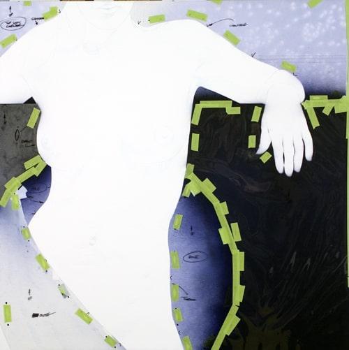
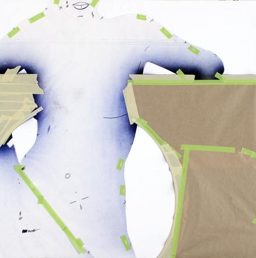
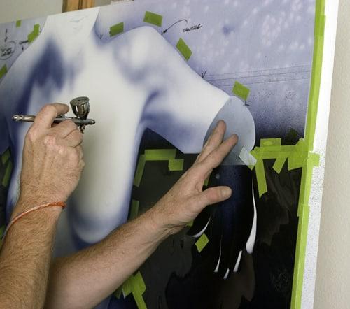
First off, before I can start any spraying, I need to replace the acetate to protect the background and reveal the figure. The background acetate pieces are replaced before the figure pieces are removed. This is where the Sharpie marks come in handy to keep everything in register. Exact registration in acetate replacement is essential. If the acetate pieces are not replaced in their exact position, undesirable light and dark lines will appear in the painting, essentially outlining the figure. Once the pieces are in their proper position I can start spraying without the worry of affecting my background.
I start off painting the figure with the same blue I used for the background. At this point, everything is airbrushed freehand using an Iwata Hi-Line HP-CH airbrush. My air pressure is set around 10-12 PSI, which creates a slightly grainy effect. I don’t want my skin to lack texture. Too smooth a skin surface and my model will look plastic and fake – too much and she’ll look rough and manly. A little experimenting on a piece of scrap paper will help to determine a desirable texture. Simply adjusting air pressure can create tremendous variations in sprayed textures.
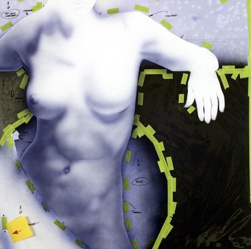
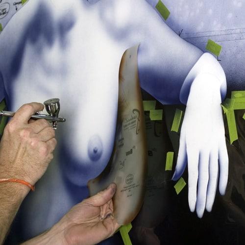
This is where saving all the acetate pieces come in handy. The original acetate pieces are trimmed as needed and positioned to create crisp edges and detail. At this point, I’m still keeping everything light. IIt’seasier to darken areas later. My goal here is to bring the color up globally, rather than completely finish any given area. By doing this, I’ll get a better idea overall of what everything looks like and can make adjustments accordingly.
Artool Airbrush Templates are used to add crisp lines and bring out details as needed. Holding the shield away from the surface a little while spraying can create edges with a bit of softness to them, which tend to look more realistic than overly-crisp edges. It doesn’t take much. Simply holding the shield 1/8″ “to 1/4” “away from the surface will change the edge considerably. I use The Bird Shield by Radu Vero (RV-2), which happens to be one of my personal favorites for painting breast shapes. It’s perfect for the scale of my work. Using the shield’s different curves can create positive and negative shapes, which are desirable to create a convincing illusion – in this case, the inside and outside shapes of the breast line. I’ll use a lot of different Artool Airbrush Templates in the process of creating my paintings. I especially rely on the Freehand Match-Makers, designed by my buddy Michael Cacy. They make short work of painting hands and fingernails.
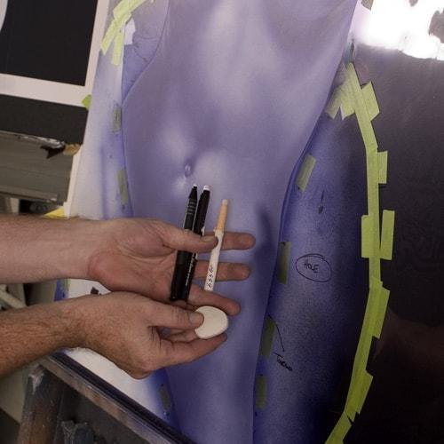
There’s still a long way to go, but at this point, things are starting to shape up overall, so I’m going to take a break from spraying and pull out some erasers to establish some lighter detail areas. Creating these paintings is a process of applying and removing paint to adjust everything as needed. Erasers are especially useful in establishing variety by creating convincing textures. Some caution should be applied when using erasers; a little goes a long way, and it’s relatively easy to do damage if patience and restraint are ignored. Erase softly and work slowly. In the same way that more paint can be added, more can be removed later as needed, but we’ll want to be careful here to not add too much texture by erasing too much too fast. This shot shows a small sampling of the variety of erasers I use.
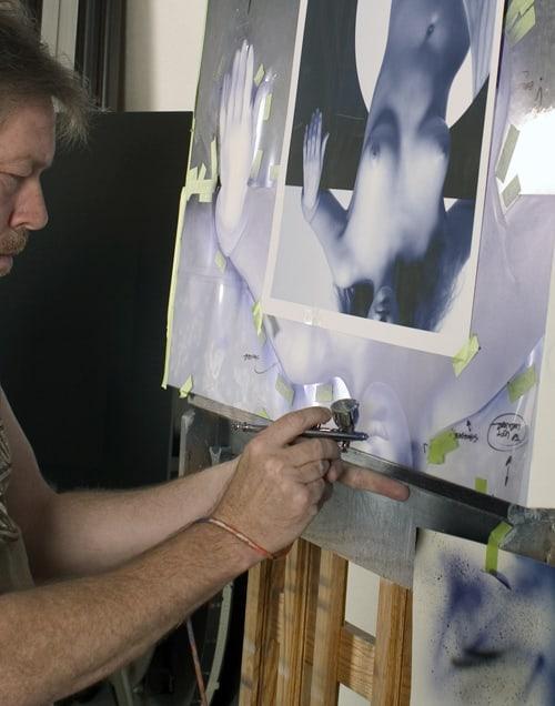
After some erasing, I’m back to airbrushing some more color, so pull out the shields, rotate the art, and start spraying. Notice here that the painting is upside down. I rotate my art in the process often during painting. This helps me see details that I might otherwise miss – things become shapes, allowing us to see what is there instead of what we think we know. Equally important to rotating art is keeping your reference images close to where you’re working. Here you see my reference photo directly in front of the painting.
Well, that’s it for this one. Finishing the painting is simply more (lots more) of the same techniques as described above. Thanks for following. Click here for more details on Eclipse.
- About the Author
- Latest Posts
- More info

A.D. is an artist who started drawing at a young age. Throughout his life, he has worked with different creative tools in traditional and digital art and design. His art and writings are showcased in various publications such as Airbrush Action Magazine, Airbrush Magazine, American Art Collector, America’s Sports Car magazine, Art & Beyond, Easyriders, Las Vegas City Life, Las Vegas Weekly, L’Vegue, ModelsMania, Quick Throttle, The Ultimate Airbrush Handbook, America’s Sports Car, The New York Times, and The National Corvette Museum 2024 Annual Report.